BRAND KIT® — STYLING
STYLING
Visual styling conventions define the tactile and spatial language of the brand. Roundness, hierarchy, and the treatment of sub-brands are not design preferences — they are specifications.
01 — ROUNDNESS
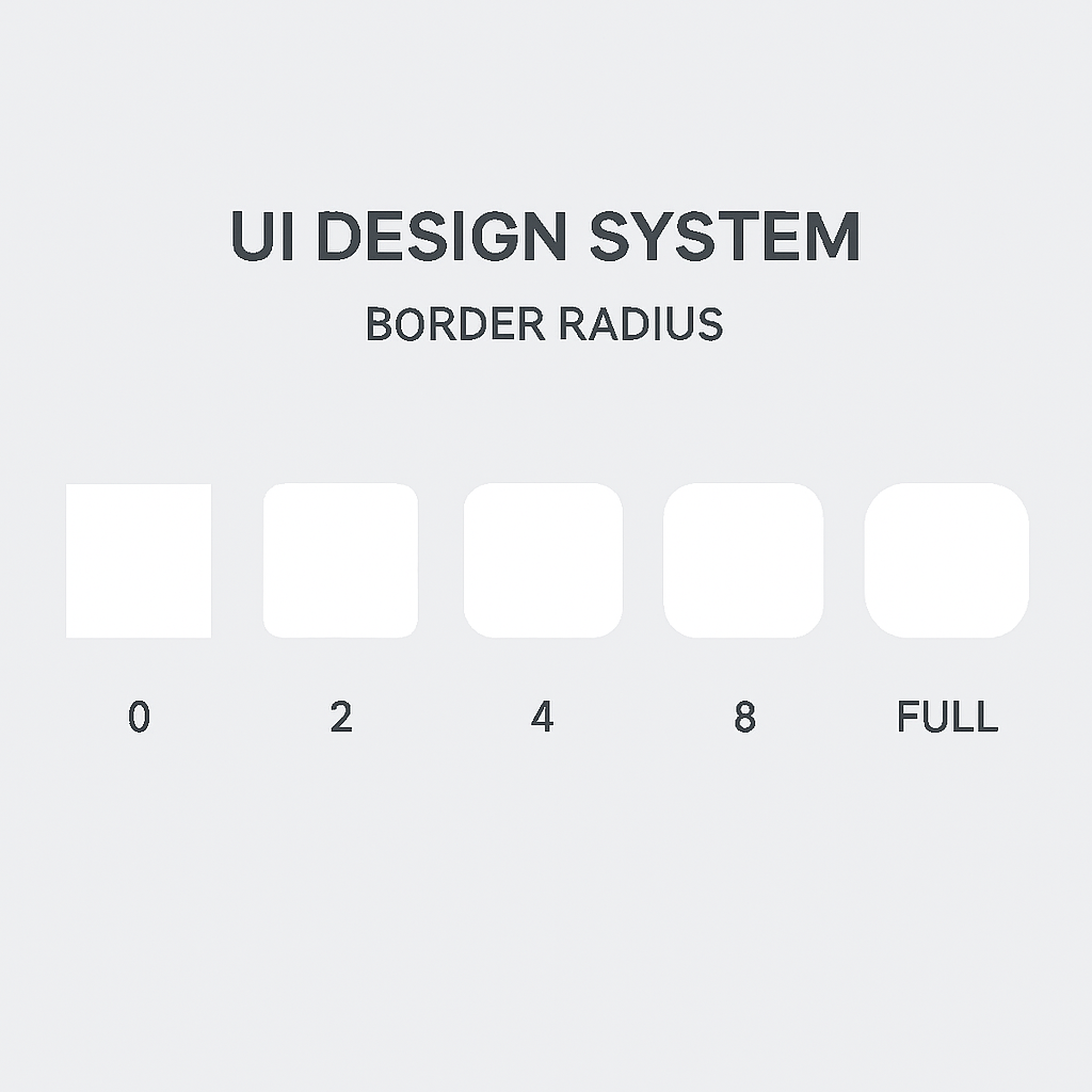
Border Radius Scale
Corner rounding communicates friendliness and approachability without sacrificing precision. The brand uses a defined scale — no arbitrary or intermediate values permitted.
None
0px
Technical, data-dense UI
Small
4px
Inputs, badges, tags
Medium
8px
Cards, modals, tooltips
Large
16px
Panels, sheets, drawers
X-Large
24px
Featured cards, hero containers
Full
9999px
Buttons, pills, chips
02 — HIERARCHY
Visual Hierarchy
Hierarchy is communicated through weight, opacity, and scale — never through color alone. Four levels of text hierarchy exist; no additional levels should be introduced.
Primary
The quick brown fox
WEIGHT
700
OPACITY
100%
USAGE
Page titles, section headings, key callouts
Secondary
The quick brown fox
WEIGHT
500
OPACITY
80%
USAGE
Subheadings, labels, emphasis within body copy
Tertiary
The quick brown fox
WEIGHT
400
OPACITY
60%
USAGE
Body copy, descriptions, supporting text
Quaternary
The quick brown fox
WEIGHT
400
OPACITY
30%
USAGE
Captions, metadata, timestamps, inactive state
03 — SUB BRANDS
Sub Brand Structure
Sub-brands extend the parent brand into specific verticals or product lines. They are always subordinate to the parent brand in visual weight, positioning, and typographic scale.
BRAND KIT®
— STUDIO
HORIZONTAL LOCKUP
BRAND KIT®
STUDIO
STACKED LOCKUP
- 01Sub-brand lockups always subordinate to the parent brand mark
- 02Sub-brand name appears in Base Sans Regular, never Bold
- 03The separator between parent and sub-brand is " — " (em dash with spaces)
- 04Sub-brands inherit the primary palette; no independent color introductions
- 05Sub-brand icons must share the same geometric construction grid as the parent mark